
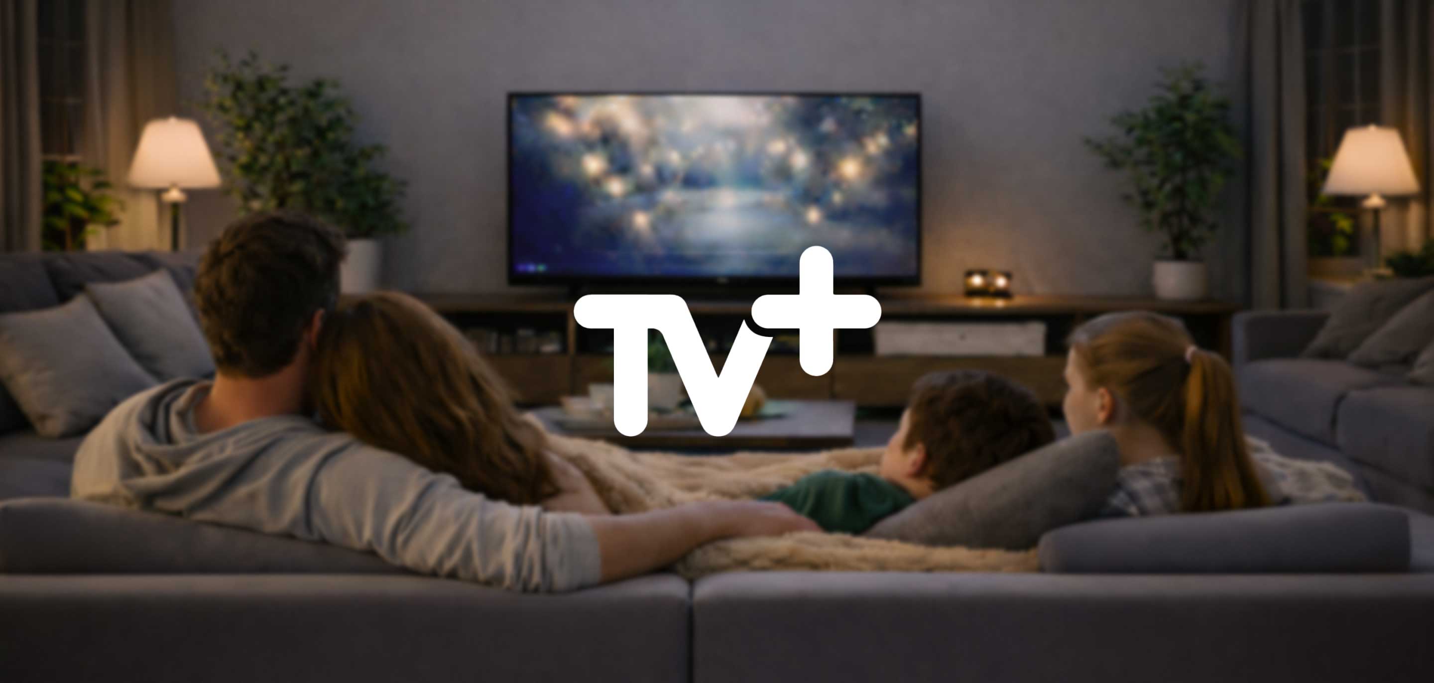
Turkcell TV+ Website & App Design
A Seamless, Unified Streaming Experience
Expertise
Design Research
Ideation & Strategy
UX & UI Design
Usability Testing
Design
System Guardianship
Design Research
Ideation & Strategy
UX & UI Design
Usability Testing Design
System Guardianship

Turkcell needed a unified, seamless TV streaming experience across devices to improve content discovery and drive video on demand (VOD) awareness.
Turkcell’s TV+ platform spans seven different clients, from mobile apps to smart TVs, each serving unique user groups with diverse needs. The challenge was to create a consistent, unified experience that would simplify content discovery and make navigation effortless. Through a journey-based approach, we identified key friction points in the Explore and Player journeys, where users often struggled to find or manage content. Workshops with Turkcell’s teams clarified business objectives, while extensive user research, including home visits, revealed deep insights into user behaviour. Our mission was to design a scalable, sustainable design system that could adapt to multiple platforms while delivering a personalised experience that felt both powerful and simple. The ultimate goal: increase VOD awareness, engagement, and retention by making TV+ the go-to streaming hub for all users.
To create a journey-based, user-centred design system that unifies seven diverse platforms into a single seamless streaming experience.
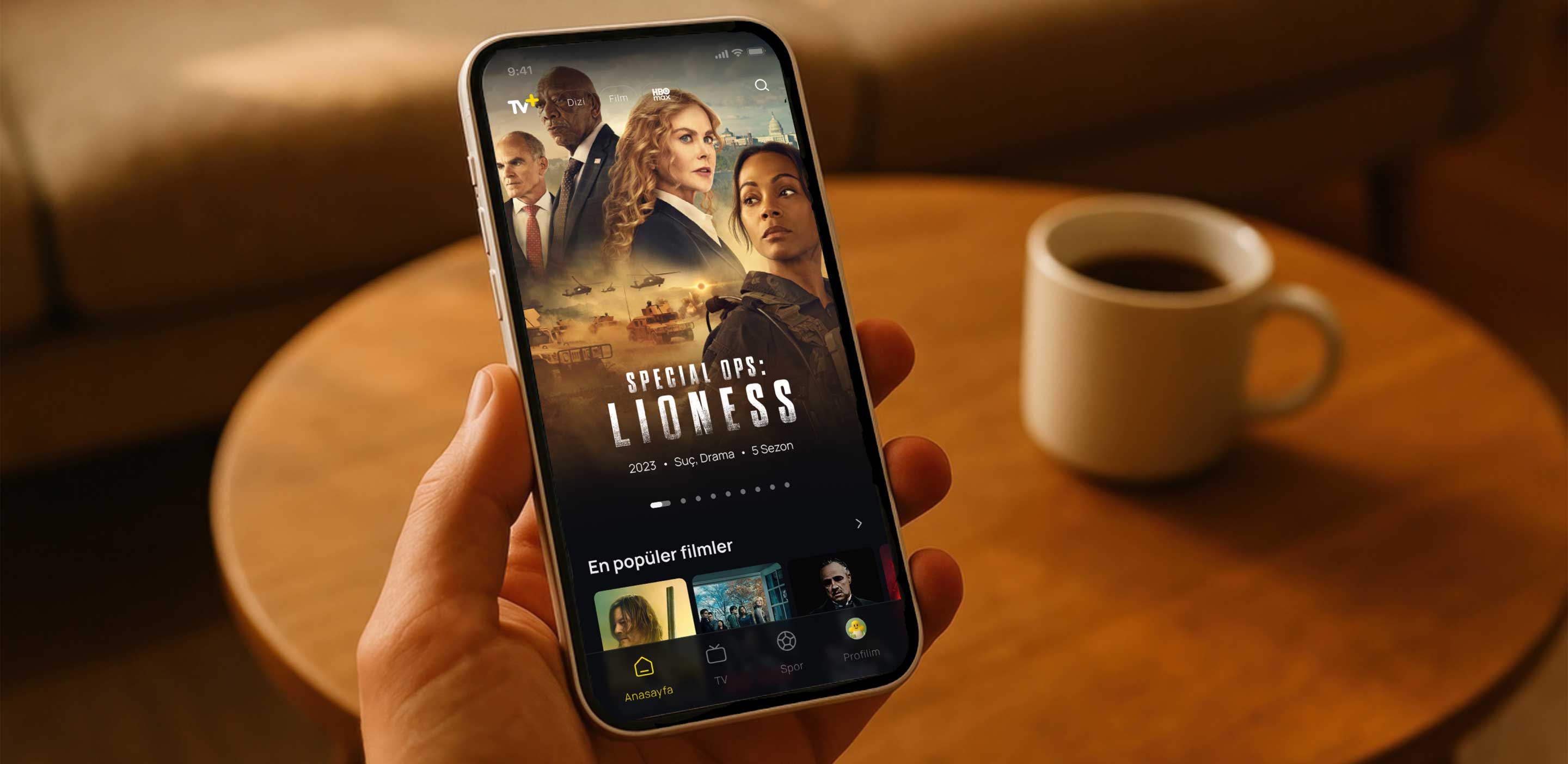
A World of Discovery
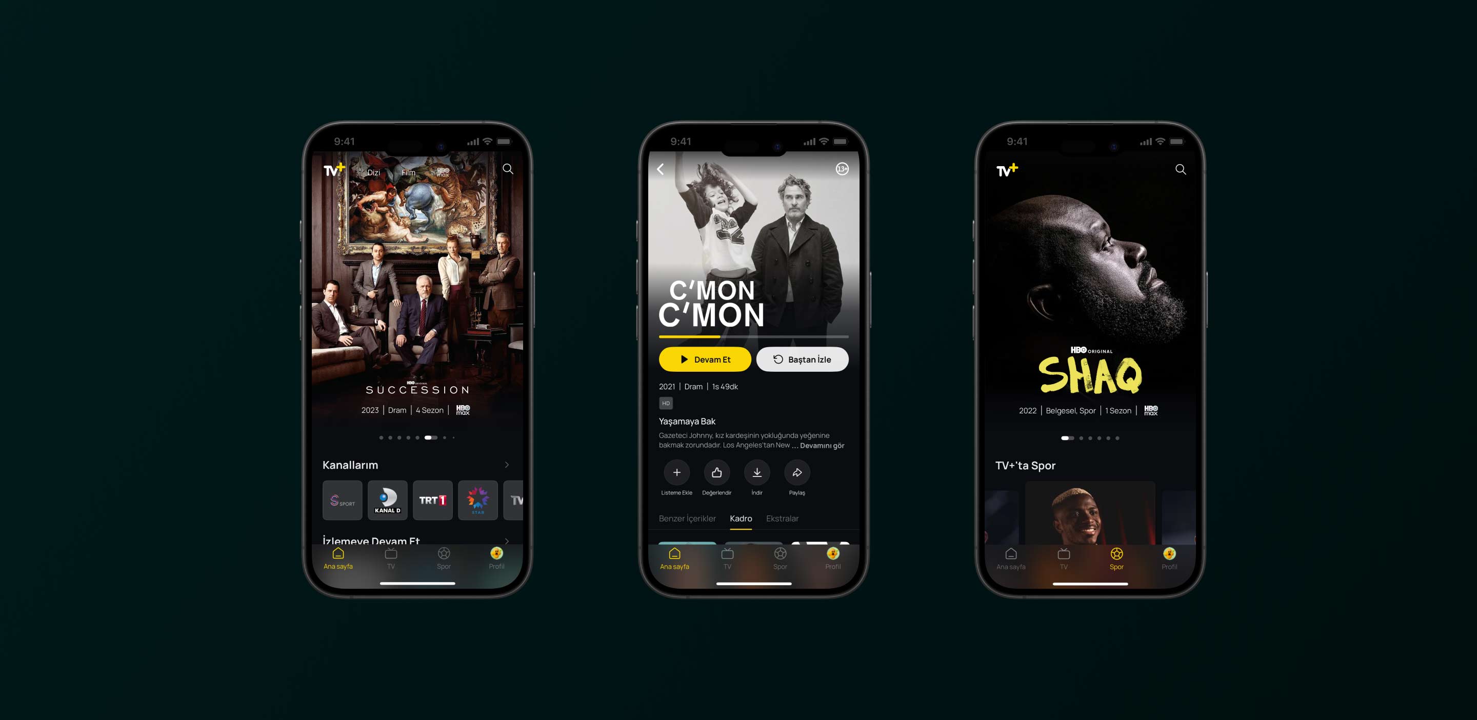
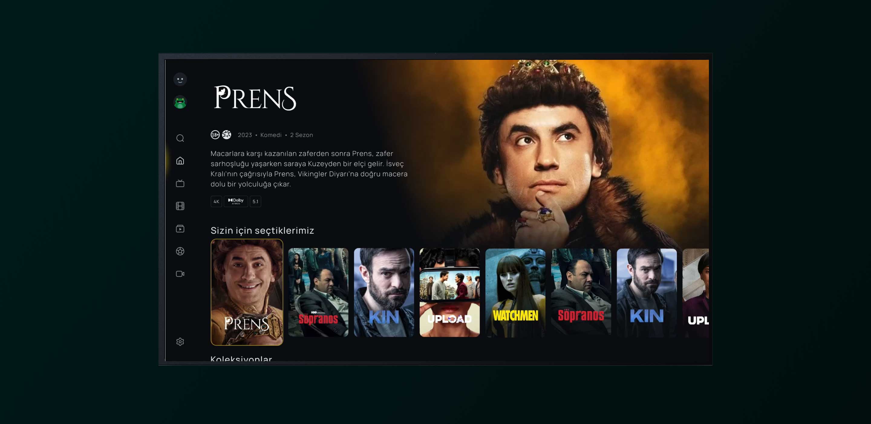
We reimagined the Explore journey to help users seamlessly browse VOD content, even while watching Live TV. By combining trailers, thumbnails, and bold visuals, we turned discovery into an engaging and intuitive experience. The result was a dramatic increase in user interaction, driving deeper engagement and content awareness.
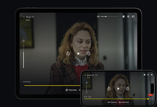
Power at Your Fingertips
The Player was redesigned to put four key actions—change channel, record, find past programs, and return to live—within one effortless step. Precision controls ensured smooth navigation without the frustration of accidental taps. This intuitive flow transformed viewing into a streamlined, enjoyable experience.
Love at First Sight
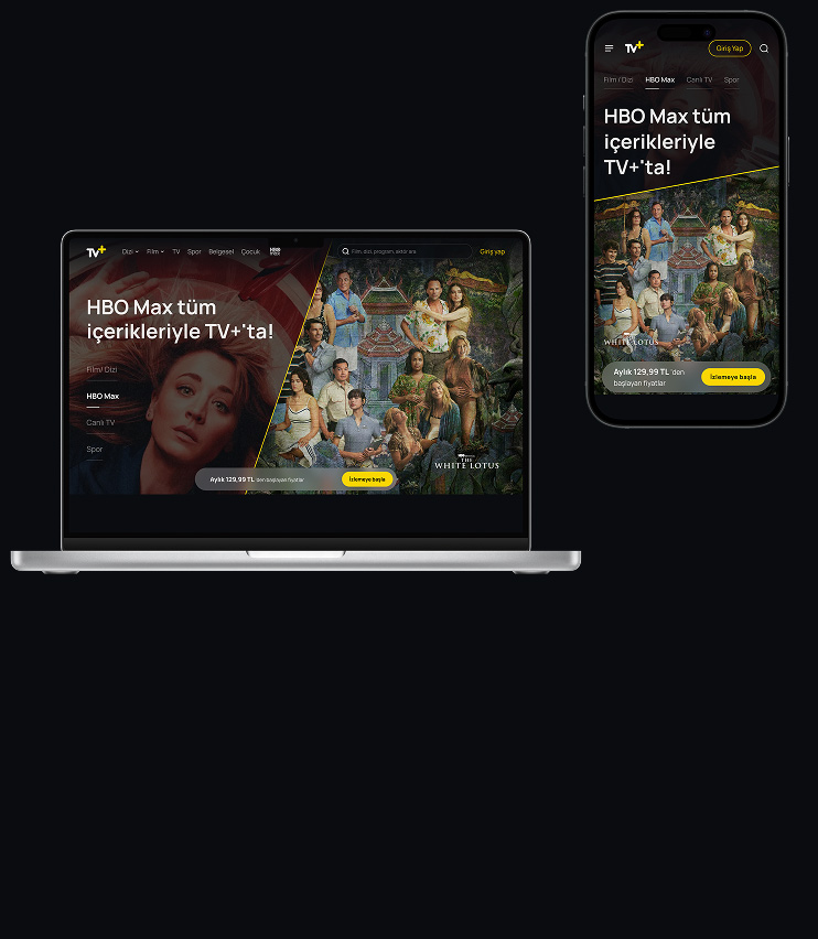
We made the first impression count by highlighting TV+’s vast content library before users even logged in. A simplified subscription journey reduced friction and encouraged quick sign-ups. This approach boosted conversions and built excitement right from the start.
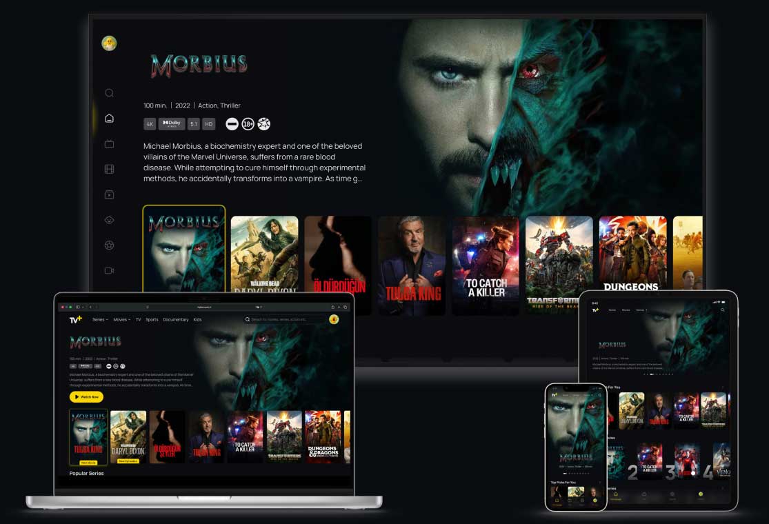
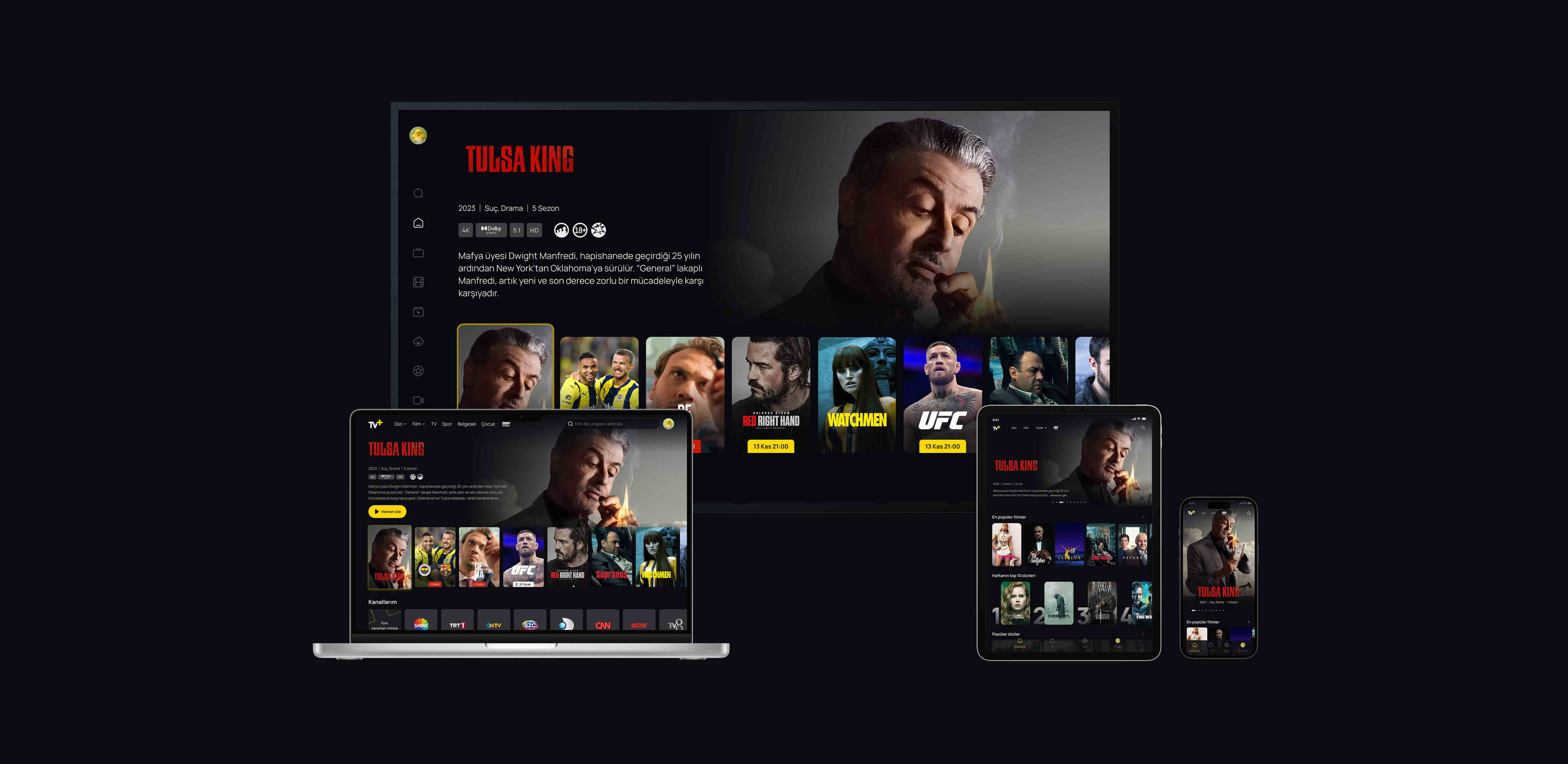
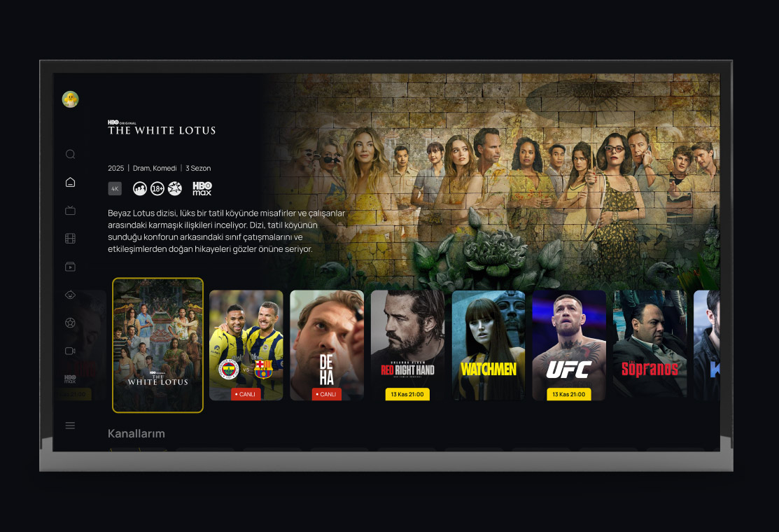
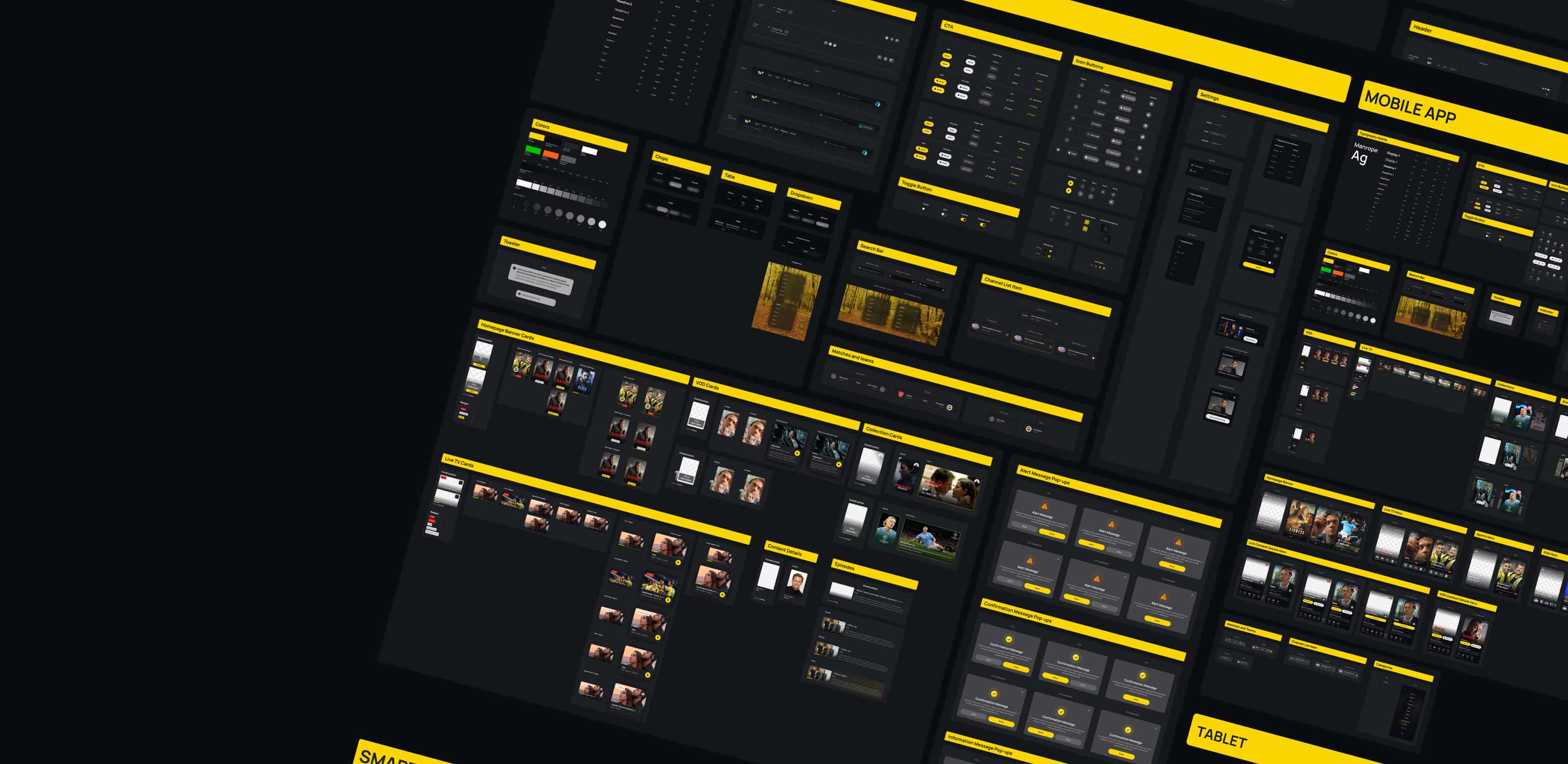
One Visual Language, Many Screens
A scalable and sustainable design system was crafted to unify seven diverse platforms under a single visual identity. Consistency across devices ensured a seamless brand experience for every user. This future-proof foundation empowers Turkcell to evolve TV+ without losing coherence.
Tested, Validated, Perfected
Every design decision was tested with real users, capturing valuable insights through hands-on usability sessions. Iterative improvements brought clarity and confidence to the final product. The result was a user experience shaped by people, for people.
TV+ required orchestrating a highly complex, seven-platform delivery ecosystem, and I-AM navigated this complexity with confidence and precision. Beyond execution, they brought a strong methodological approach grounded in customer insight, ensuring creative ideas were always aligned with real user needs and our business goals. Their ability to translate strategy into pragmatic, high-quality design solutions — while adapting to evolving requirements — was critical to the project’s success.
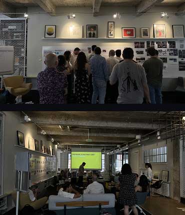
Behind the scenes
System Analysis
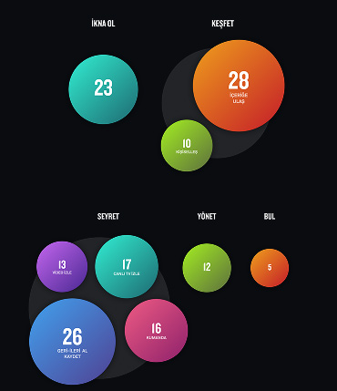
Business goals were defined and prioritised through stakeholder workshops, with a focus on increasing VOD awareness and viewing. Priority user groups were identified from the business perspective, alongside decisions on visual language. Different audiences with diverse dimensions and needs were mapped. Existing TV+ usage data was analysed, and sector benchmarks weredefinedto position the product within the competitive landscape.
User Research
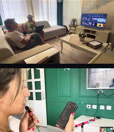
User behaviour, needs, and pain points around the TV+ viewing experience were explored through in-home visits and online interviews. The research included 7 in-home visits and 17 online interviews, conducted with 7 potential users and 17 existing TV+ users. Participants were selected to reflect the demographic distribution of defined personas. In parallel, perceptions of non-users were examined, focusing on awareness barriers and experience issues on pre-login web pages.
Structural Design
User flows and page structures were defined in line with identified user needs and business objectives, ensuring clarity, discoverability, and scalability across channels.
Visual Design
Page visuals and in-content visual elements were designed according to the new look & feel decisions, supporting content discovery and a unified brand expression.
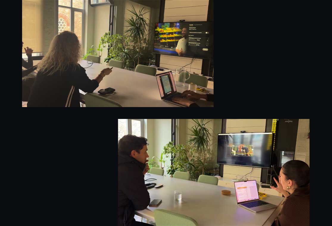
User Testing
Different channels were tested with real users. Insights from these tests informed iterative refinements, leading to targeted improvements and design revisions.
You may also like
HIFILIFE
Elevating Sound Through Experiential Retail

Babil
A Book Store In Your Pocket

Al Dawaa
Inspiring Life Long Wellness

Nike
Turning Big Data Into Art

Tower
Pounding the Pavements of London with Attitude

Turkcell
Connecting With the Neighbourhood